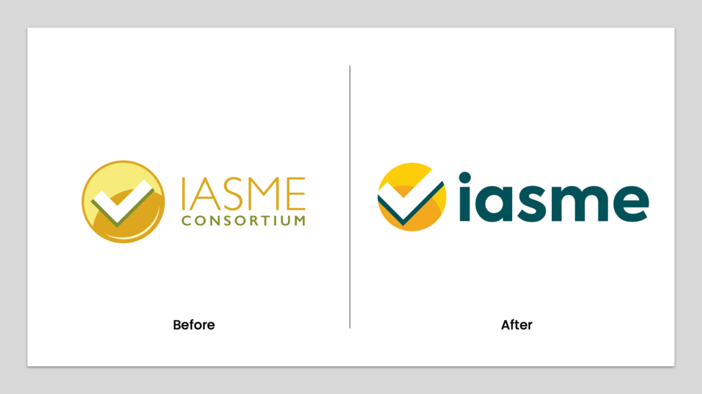
Today we have launched IASME’s new website and logo. Our new look and feel represents IASME’s focus on inclusivity, innovation and commitment to making a difference in the cyber security sector.
New tagline:
IASME – inclusive cyber security
Our tagline highlights our priority as an organisation.
New logo:

Our new logo has been designed to include a more accessible typeface with a focus on legibility. We have, nevertheless, stayed true to our original identity by retaining our trademark circle and tick motif; something that has stayed with us since IASME’s inception.
Colour palette:
Whilst staying true to the trademark yellow of our IASME brand, we refreshed the colour palette. By brightening the original yellow and introducing a bright orange and a complimentary darker teal, we give a nod of respect to our past whilst looking firmly towards the future.
Website:
An integral part of our brand evolution was the development of a new website. It was important for us to create easier navigation and user journeys for our customer base, whilst also being whole-heartedly representative of IASME as a business. Accessibility, inclusivity and diversity have been at the forefront of our new vision, and this can be seen throughout our use of imagery and the creation of a new ‘about IASME’ page that puts the spotlight on the people behind the brand.


